Branding / Design / Motion / UX
Webster Bank Rebrand
It was an exciting time to be involved in the Webster Bank rebrand in 2020. Our brand platform was built upon “Webster helps put your possibilities in motion.” A nod to the customers’ ambitious dreams and aspirations, and a nod to the customers’ progress and the ability to support them. The new visual identity is the most visible, visceral way we communicate to the customers. The modern design system was built to be human-centric, purposeful, holistic, and timeless.
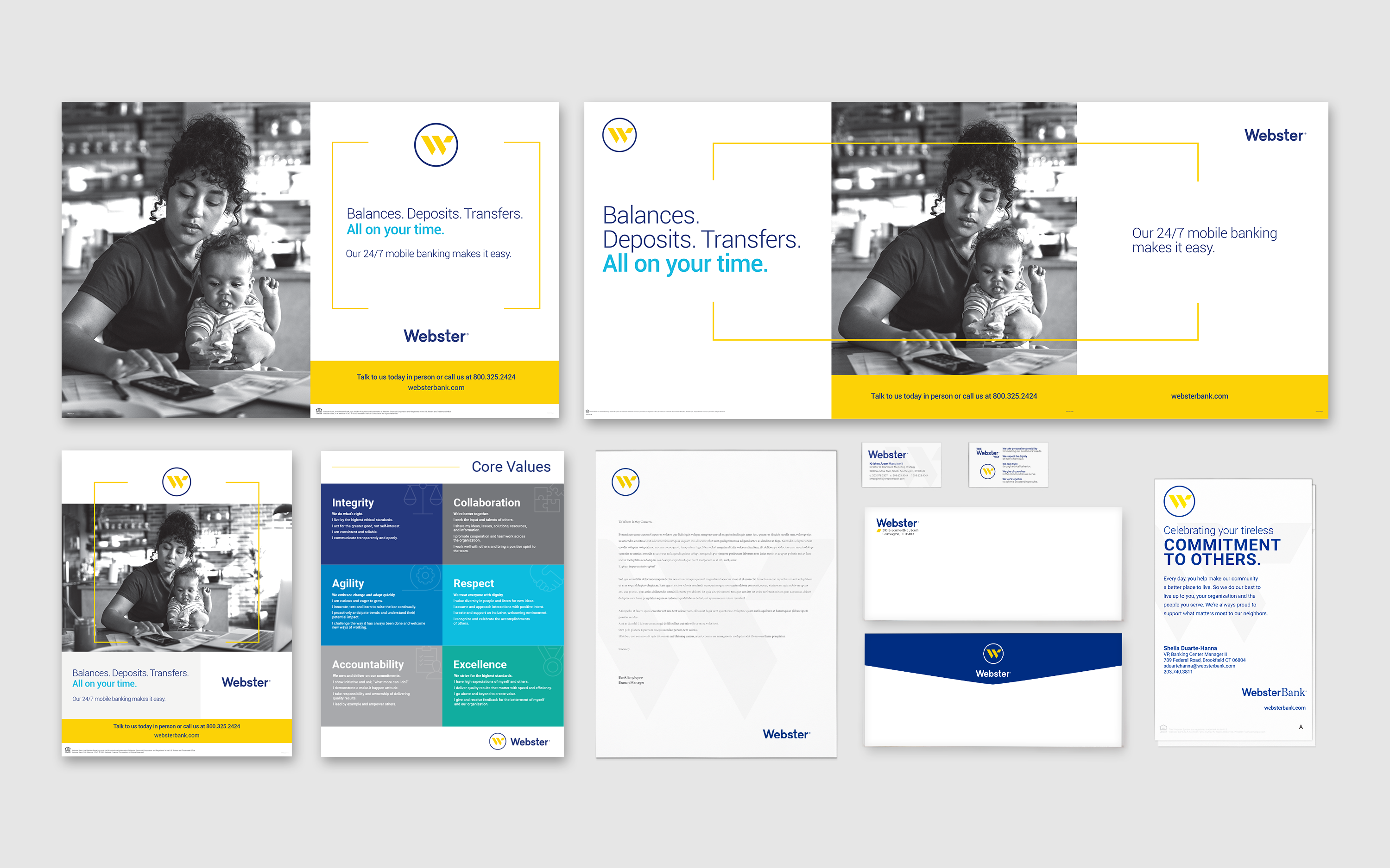
The Webster logo is the cornerstone of the visual identity, it is a combination of the symbol and logotype. The W symbol is a Monogram, a personal seal - standing for the personal promise that has always been a mark of Webster’s brand. It is widely recognized as the central element of Webster’s image and has been revisited for legibility and suitability in digital use, acquiring additional lightness. It is composed of simple geometric shapes and two primary colors. The stylized W is intentionally off-center to allude to motion. The strong logotype creates a bold yet approachable contrast to the elegance and modern W monogram, and expresses confidence and strength. These two elements are untethered, and used separately from one another in all Webster communications to create new design possibilities.
The new brand colors are based on a reduction to a small number of colors, with an emphasis on primary colors, supported by subtle grays and vibrant accent colors. White is now considered a primary brand color, giving an overall bright appearance with generous white space in design. All these elements work congruently to provide a familiar brand image refreshed into the modern day. Various logo lockups with lines of business were reduced, focusing on one overall bank with one brand image. Use of photography was also reduced.
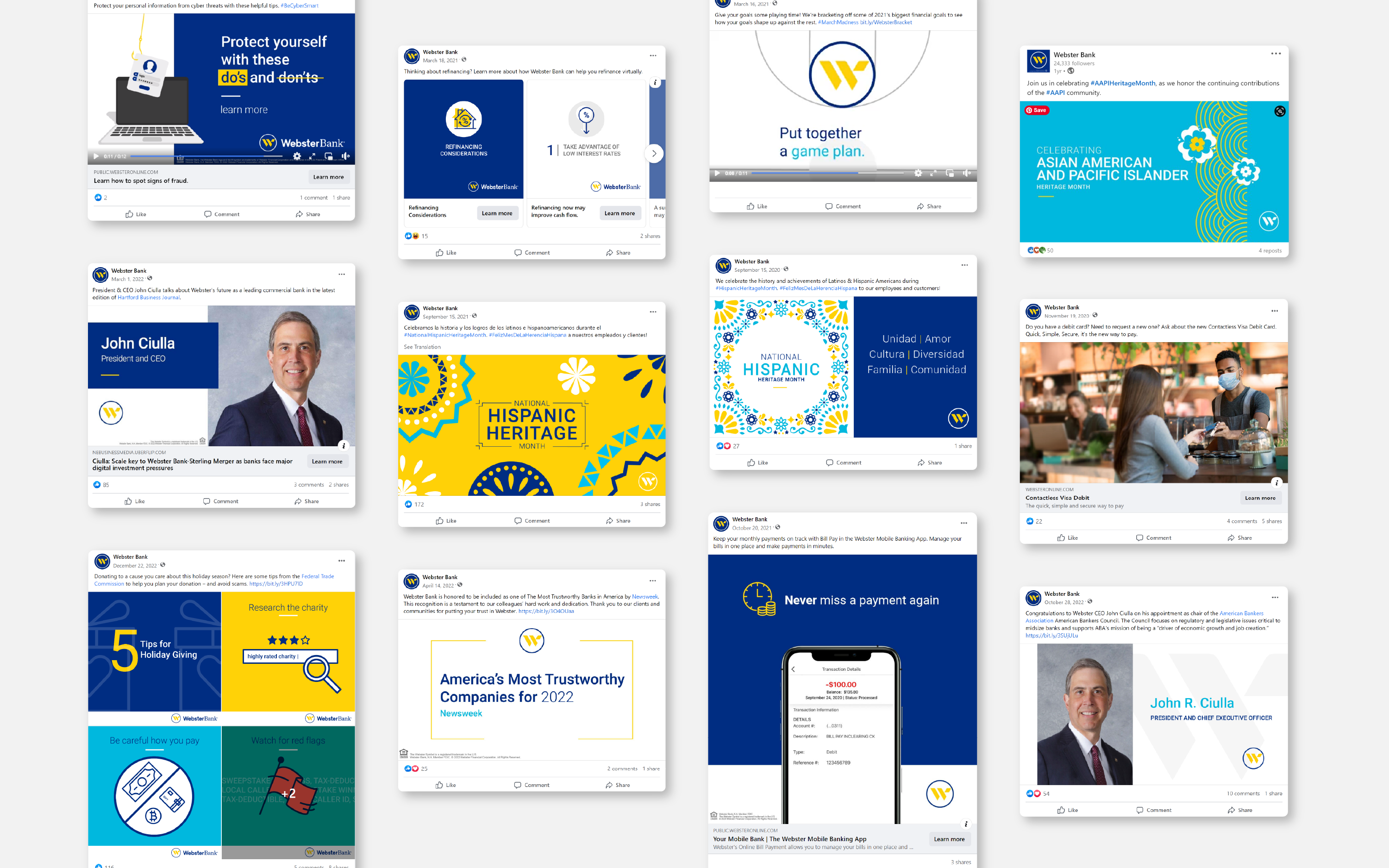
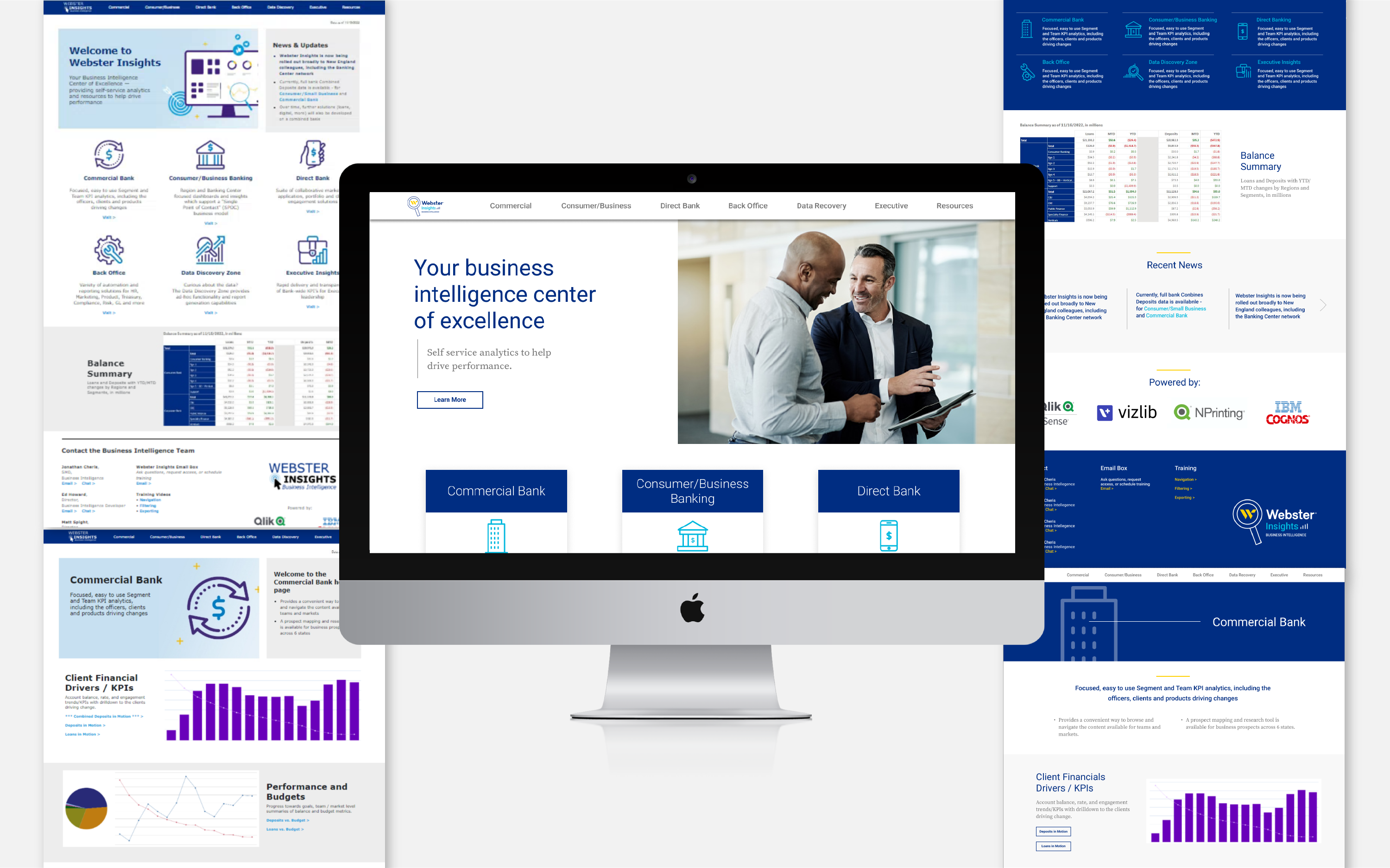
For my role as senior designer, I was tasked with bringing this new brand look and feel to life both internally and externally. Internally, I developed and updated a supporting icon library to emphasize communication points and features. It was designed to be simple line art and approachable. I also produced numerous flyers and ads for coworker appreciation and celebration, as well as developed and distributed the current Webster powerpoint template used company wide. Internal websites were also redesigned using our brand identity and user experience based approach. Externally, I was the lead designer for the social asset refresh and campaigns. This also includes all motion design pieces, such as mobile banking tutorials, educational videos, and commercials. Additionally, I had the opportunity to lead design and layout of the annual report and environmental, social, and governance report. I also collaborated with other designers and the creative director on numerous campaigns with environmental signage, such as banking center advertisements, atm wrap and advertisements, and train station advertisements.